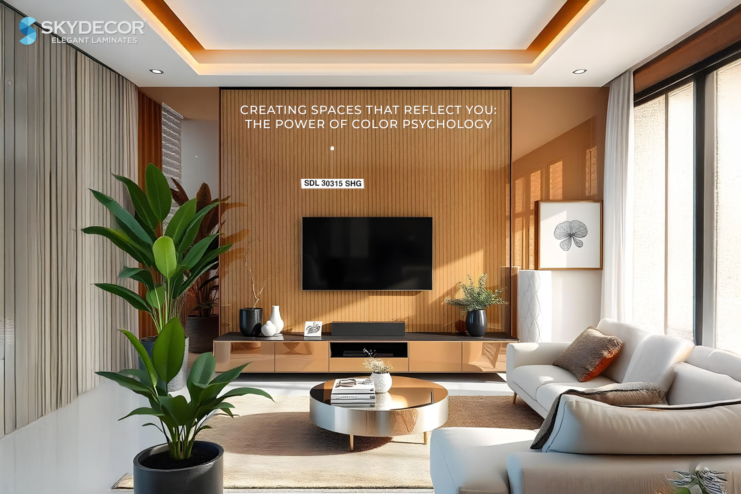
Color selection goes beyond mere aesthetics; it's a powerful tool that can evoke specific emotions, alter perceptions of space, and significantly impact the well-being, productivity, and attitude of those who inhabit it. This blog will guide you through the basics of color psychology, helping you create a space that truly reflects your personality. The Science Behind Colors in Interior Design When it comes to color psychology in interior design, we rely on scientific research that illustrates how colors influence the atmosphere and perception of spaces. Selecting complementary colors involves thoughtful consideration of how they interact with one another. Let’s dive deeper into the emotional effects of various colors and how you can use them to craft the perfect environment!
BLUE: The Color of Calm Blue, the strongest hue in the color spectrum, is celebrated for its calming effects. Lighter shades evoke serenity and tranquility, making them ideal for bedrooms or calming spaces. In contrast, darker tones like navy blue exude confidence and success, perfect for professional settings. Furthermore, pairing blue with crisp white creates an airy feel, capturing the essence of summer and the great outdoors.
YELLOW: The Cheerful Energizer With its sunny disposition, yellow is perfect for making a space feel cozy and welcoming. Its bright energy fills rooms with positivity and happiness, making it an excellent choice for kitchens, drawing rooms, and even modern offices that seek to inspire creativity.
GREEN: The Nature-Inspired Refresh Representing nature, green imparts feelings of growth, rejuvenation, harmony, and balance. From deep emerald tones ideal for drawing rooms to fresh lime shades, green instantly livens up any interior, bringing a refreshing element to your space.
RED: The Bold Statement As the color of passion, red commands attention and is not easily overlooked. It represents power, vigor, and sensuality, adding depth to designs. While red is fantastic for bold architectural projects, it's generally better suited for specific accents rather than as a primary hue in personal interiors.
PURPLE: The Regal Touch Purple carries a sense of royalty and sophistication. Darker shades convey luxury, making them perfect for upscale brand outlets. Conversely, lighter purples, such as mauve and lilac, present a playful, homely vibe that encourages experimentation, making them ideal for guest rooms or personal spaces.
BLACK AND WHITE: The Timeless Duo Black symbolizes luxury and sophistication, while white brings a sense of purity and space. This classic combination creates a minimalist aura, balancing the boldness of black with the brightness of white. Together, they form a stunning contrast that harmonizes beautifully in any setting.
Wrapping It Up: Embrace the Color Code Now that you have a fundamental understanding of color psychology and the interplay of colors, you're ready to make informed decisions for your space. Harness this knowledge to select the right colors that resonate with you and your project's vision at Skydecor. If you enjoyed our blog, subscribe to stay tuned for more content!